Monday, February 11, 2013

Viewfinders - How To & How NOT To!!

Last week I had kids make viewfinders to use in creating their mini-abstacts (here). Most 5th graders had no problems with the basic directions. For others, not so easy!!
Here were the steps:
Fold: "hamburger" style (fat), not "hot dog" style (skinny).
 Trace around rectangle which is placed ON THE FOLD. I wanted the viewfinders to have 1-inch square cut-outs. Since I don't have 34 standard rulers and we weren't going to have that much time, I had pre-cut some little 1" X 1/2" rectangles for the kids to use as a quick stencil.
Cut out.
Finished product!!

Now, in all fairness, most students came pretty close to making a viewfinder like the one above.

However, there were these, too:

 This little rectangle was folded in half around the fold.
This student placed the short end of the rectangle on the fold.
You KNOW what happened here, even though we talked about this before starting.
And then there were those that had trouble determining a "skinny" vs "fat" rectangle.

I know that with Valentine's Day creeping up, many teachers will be sighing as they observe similar cutting skills this week. Even though we model, demonstrate, remind students of possible pitfalls, we will still see that some students just need a little more time and practice. So, the word of the week: PATIENCE!!!! Have a fun Valentine's Day!

ps. To all of you on the East coast who may be shoveling out about now, I wish you well. Here in Southern California we are already seeing signs of Spring!!!

Thursday, February 7, 2013

Mini-Abstracts

I haven't had kids use viewfinders in YEARS, but a post I saw last November here got me thinking about them again. I tried a few "mini-abstracts" of my own during the Winter Holiday using catalogues I was getting ready to discard. I was immediately hooked for several reasons -- I'll get to those later. First, though, let me show you some 5th grade results:
Love the movement captured in this drawing!!!
This student worked to carefully place color blocks accurately.

What a nice example of shading in the white area!

These were all completed in one class session (about 40 min. working time).

We started this project looking at a small "abstract" photo on the Smartboard, identifying properties (shapes, colors, shading, etc). Students then tried to find where this cropping came from in the larger photo.
I modeled how to make a viewfinder, mark the midpoints on the viewfinder and the 6" square of drawing paper to use as register marks and overlay crayon colors to blend exact hues. As it turned out, that is a whole other article that I'll post later.

You can see how this student shaded his reds with orange and black.

I asked students to choose drawings that were non-representaional. This child turned his drawing sideways to create his abstract. These were actually 2 chicks -- but I love the way they look abstract at this angle. He actually worked very hard to capture shadows and texture that he observed.
I asked students to mount their drawings, first on a color of their choice, and then onto a 9" X 12" piece of black construction paper along with their viewfinder and  magazine selection. Part of my lesson was teaching children about mounting their work leaving black showing on all sides of their mounted work. These kids are often asked to create posters or visual presentations in their regular classrooms, so this is another useful skill for them to have.

Aside from that, why do I like viewfinder exercises so much?? Well, first, I find that the small scale helps to train the eye for larger observational drawings. Second, color matching is an acquired skill that gets better and better with practice (as with anything, I guess!). And, finally, I LOVE how the results provide so many examples for discussion of composition, not to mention pattern, color, repetition, etc., etc........ I think, that if I taught in an upper elementary regular classroom, I would be doing these or variations of these once a month!!!

Wednesday, January 30, 2013

Shape & Form Display


Every February our school has what is called a "Kindergarten Round-Up" where parents of future kindergarteners are invited to a presentation by the principal and then a tour of the school. They start in the Auditorium, so today a parent volunteer and I put up all of the multi-media collages that 5th graders finished 2 weeks ago. I love looking at these works displayed together. Even though I have posted about these before, I thought I'd share a few more:


The student artist of the upper right piece used black crayon for the designs on his small cut shapes, but instead of using watercolor for the background extensions, used pencil. I love the difference in intensity!


You can see how students started with crayon patterns on cut-out shapes. They glued the shapes to their board so that they had form. Finally they extended the crayon pattern onto the flat background using watercolors and VERY careful brush strokes.
If you missed the original post, the lesson is here.

Saturday, January 26, 2013

"Awesome Fish!!"

"Awesome fish!!" 5th graders exclaimed as Japanese artist Naoki lifted the rice paper revealing his Gyotaku (fish print) in the video here. They said the same thing as they lifted the regular copy paper (taken from the printer) to see their own prints. Students used black cake tempera, being sure NOT to add too much water so they would get crisp, clear prints.

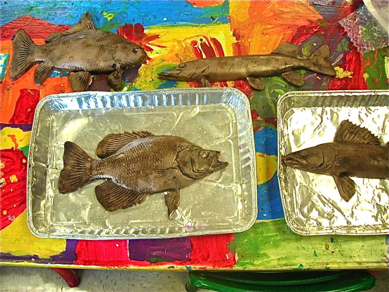
My first year of teaching, MANY years ago, I did this with real fish. It worked just fine, but I do remember that 1st graders were a bit reluctant to touch the dead fish -- even with a paintbrush!! This year I splurged and ordered a set of 5 rubber fish from SAX ( here). I put each one in an aluminum tray, which worked really well to define the space and cut down on mess.
One group of kids at a time brought their printing paper back to a "printing table" near the sink and gingerly attacked their task. It was interesting how many of them reacted as if the fish were real!!

While one group printed, the rest of the class worked to create their background underwater scape. I posted several photos of sea plants on the whiteboard for reference and modeled how to press hard with the crayons. I asked that they make each plant have AT LEAST two colors in them, reminding them of previous work we have done with creating dimension by shading one side of a shape. I also asked that their plants of variety of height, color, shape, etc. and that they try to produce the feeling of movement that would be created by moving currents under the water.

When it was time for their watercolor wash, I asked students to stand and mentally plan their steps. (1. quickly brush plain water everywhere, 2. quickly drop blue liquid watercolor paint into the water, blending with the tip of the brush, and 3. adding drops of green or purple (cool colors) if they wished. I had them use cake tempera for this last step.) All painting was done standing up to help with the speed. The key here, of course, is to not overwork the paper. Even 5th graders seem to still want to keep painting over the same areas over, and over, and over.... you get the idea!!
Once the paint was on, students could sprinkle rice in puddles to create bubbles. They had to do this quickly, too, before the watercolor started to dry.
Then they used pieces of bubble wrap to press larger bubble shapes into the water.
And, finally, each piece was placed on the drying racks until our next class, when kids will see what all their "bubbles" look like, cut out their fish and glue them onto their backgrounds. I'll share some results when they are done.

I was motivated to try this process again after so many years by several gyotaku projects posted on other websites last year. You can see these other approaches posted here on my Pinterest Printing Board.

Thursday, January 17, 2013

Frank Stella - like Abstract Collage Results

Here are a few of our 5th graders' finished 3-D collages. I wrote about the lesson here last week.
Students first made 3 crayon patterns using complementary colors on paper they had cut to whatever shape they wanted to paint on (following Frank Stella's advice to "Make what you want to paint on.")
They glued them on a piece of 8" X 10" foam core and used water colors to "extend" their patterns onto the background.
One boy wanted to extend his pattern around the corners onto the sides -- GREAT idea!!
A few are on display in the classroom, but the rest will be posted in the Auditorium for all to see. The pieces stick out too far for me to mount them on our glass display boards.
 Students found the brush control necessary to paint some of these more intricate designs pretty challenging. I am trying to decide whether to display them as separate entities or....
push them together like this (above) and make a more collaborative display.
I am kind of liking this "together" idea. I can have the kids work together to find sets where the colors from one piece merge with the same colors on another piece -- like the orange/blue sections above. What would you do???


Saturday, January 12, 2013

Frank Stella: "Make what you want to paint on."

Using the dimensional art of Frank Stella and this great little video clip of the artist explaining how he began creating the shapes of his "canvases" (click here for video), our 5th graders set out to make the shapes that they were going to use to make their art on.
Everyone started with a rectangle of white drawing paper. They were to make 2 cuts (one long and one shorter) to create 3 interesting shapes to design. I asked that they either make 2 straight cuts, or 2 curvy cuts -- but not to mix them.

Next, after reviewing what complementary colors were, and why artists often use them together (for contrast), I asked students to design each of their pieces using 2 complementary colors or black and white.
The next step was to glue the pieces on a piece of foam core board (paper would work, too) manipulating them to stick out from the board and off the board, too, if they wished.

Here are a few that are drying.

Next week we will be using watercolor to extend each of their designs onto the boards.  This part of the lesson will focus on trying to match the colors using a different media and brush control.
For this piece the background is done with watercolor and we can talk about the fluidity of the paint vs. the more solid feel of the dry medium.
This background is done with pencil as the 2nd medium. It presents the opportunity to discuss different gradations of color.
Here is another sample that varies from the complementary color requirement. It also has black crayon lines defining the designs, which makes it easier to paint without the colors running into each other. This would be good for emphasizing repetition of color, line direction, etc.

I originally saw this project done at Whittier International Arts Program using oil pastels and watercolor and more than 3 or 4 pieces of designed papers. The results were fabulous (but, unfortunately would take more time than we have allotted.) Please check out their results here.

I'll post our results next week. I can't wait to see them!!!!!!

Sunday, January 6, 2013

Back from The Holidays

I find that holidays with family and friends are wonderful times to rejuvenate. These last few weeks I spent some time viewing the annual boat parade at Balboa Island, holiday meals with family and then a short trip to Carmel, CA where the weather was unseasonably glorious!! (Check out the 16 foot surf!!!!)


I returned to the pleasant surprise of a nod from fellow art teacher, Phyl, at There's a Dragon in my Art Room, in the form of a Premio Dardos Award.

The Premio Dardos award  is a virtual award sent as a ‘gift’ from one blogger to another as “recognition for the creativity, effort and dedication” we each put  into our blog. The award originated in Spain around 2008-2009 and has been sent from blogger to blogger ever since.

 To accept the award, you simply:

  1. Link back to the person who nominated you (which I did above)
  2. Display the award icon (also above), and
  3. Nominate others whose blogs you admire for these qualities.
#3 is always hard for me to narrow down, and I know that this award has already been passed to many art teacher blogs so I may repeat (my apologies). While I spend most of my blog time visiting art teacher sites, some places I go have a different focus and I am including a couple of those sites, too:

     1. I like Kimmie's images (and ideas) on Art in Red Wagons.
     2. Art with Mr. Hall has some great student work that often celebrates ideas he has found on other blogs and then tweaked to achieve new results.
     3. One of my favorite places to visit is Chronicles of a Country Girl. Kate is the epitome of a dedicated  blogger. She is such a talented photographer and is so generous with her techniques and her observations. I always leave her blog feeling just a little bit richer for having stopped by!!
     4. Mrs. Tannert at Field Elementary Art Blog has posted some lovely student work. I especially liked her November post of enlarged animals here.

I hope you enjoy visiting these sites.

And now, after all this rest and rejuvenation, it is back to work tomorrow.  I LOVE the project that 5th graders will be working on this week and will share with you very soon. Here's to a Happy and Artistic New Year for us all!!