Yesterday I was packing up the box of materials that Prang/Dixon sent me to review to take to school and realized that I had not yet field tested the last item: colored markers. While I don't use markers often in the art room, I have always purchased Crayola brand. As a matter of fact, I didn't know that Prang made markers.
The Prang set of "10" actually had 12 markers -- a little bonus. They have 2 shades of blue and green. The Crayola set had the standard 10 colors. You can see the colors in the top photo. The top row in the above photo shows sets of 4 vertical, side-by-side strokes. You can see that the Crayolas make a much wider line.
When I use markers in my art room it is usually in connection with water and watching the color spread, like in my "Twisted Circle" lesson (HERE). So, I tried twisting the bottle cap lids with 2 primary colors to see how the colors ran together. The Prang darker color blue did not run well, but the lighter blue was OK. All the Crayola colors run together quite well.
The bottom stripes (above) show what happened when I brushed clear water between the marker lines to see how the color would "float" on the water.
Finally, and most important, take a look at the individual pens. Prang has white caps, which is fine. The points and the felt was what interested me most. Remember those first vertical lines I drew where the Crayola produced a much wider line? The angle of the felt marker point is different in these 2 pens. The Crayola creates a wide line MUCH easier because of that angle. Also, the angled side of the Crayola is perfectly straight, while the Prang's is slightly rounded. That rounded side makes it harder to draw a straight, thick line. I also found that, while the intensity of the Prang colors was a bit more vibrant, the pen tip sort of make a scratchy sound as I pulled it across the paper, sticking now and then. The Crayola pen glides easily. If it was difficult for me to get the lines I wanted with the Prang marker, I imagine it would be even harder for students. Sorry Prang, I'm sticking with the Crayolas for colored markers.
So the final result of all the products?
1) Dixon Ticonderoga vs. any other brand - Dixon wins hands down!! Full review here.
2) Prang Semi-Moist Watercolors vs. Crayola Washable - Between these 2 I would take the Prang, but if I were comparing the Prang Semi-Moist to regular Crayola pan watercolors I could go either way. Full review here.
3) Prang Colored Markers vs Crayola Colored Markers - Definitely, Crayola.
Remember, Prang offered us a complimentary Prang coupon here for considering their products.
Monday, September 2, 2013
Sunday, August 25, 2013
Color Theory and Prang Test
I LOVE color and I love teaching color theory. So earlier this month when I saw a cool poster on a Pinterest board (here) I decided to make my own for the classroom. Before I glued each example on the chart, I scanned them separately to use on the Smartboard later when I am focusing on a particular area.
I started by discarding the brush from the Crayola Washable set. It is one of those plastic brushes with bristles that are cut straight across at the tip - no way you are EVER going to get a point with that brush. Then I compared the Prang brush from this new set to the brush I have been using for awhile from an older Prang Pan Watercolor set. The older brush is on top and appeared to form a better point when put in water. But, I gave the new brush a try. After about 5 minutes I switched back to my older Prang brush because I got tired of picking hairs up from my painting!! This won't be an issue in the classroom, though, because we use different brushes altogether.
Then, of course, I started fooling around with some projects using some of these ideas.
First, I thought about having students divide their paper in fourths (using a ruler, and measuring). I met with some local art teachers not too long ago, and we were all bemoaning how many kids manage to get to 4th grade without having mastered this skill!!
After making some more divisions, I used cake tempera to mix colors in each section, showing a variety of the color theories on the chart (warm/cool, monochromatic, etc.)tertiary, etc)
Then I started thinking about that box of art materials that Dixon/Prang sent me to review and got out their Prang watercolor pan, the Crayola Washable set that they sent me and my own regular Crayola pan (not washable).
I started by discarding the brush from the Crayola Washable set. It is one of those plastic brushes with bristles that are cut straight across at the tip - no way you are EVER going to get a point with that brush. Then I compared the Prang brush from this new set to the brush I have been using for awhile from an older Prang Pan Watercolor set. The older brush is on top and appeared to form a better point when put in water. But, I gave the new brush a try. After about 5 minutes I switched back to my older Prang brush because I got tired of picking hairs up from my painting!! This won't be an issue in the classroom, though, because we use different brushes altogether.
First I made some circles and tried painting various stripes. Most of what I ask students to do with watercolor is not this controlled. We are more apt to use them for washes and wet-on-wet work. But, I was mostly testing color intensity here. Prang is on the left and Crayola Washable on the right. At the bottom I did a quick color comparison adding my old Crayola (non-washable variety) pan watercolor. I have never used washable watercolors before, so I didn't know what to expect. Although it doesn't show too well in these photos, the washable blue was almost an aqua and purple was more of a magenta. I also had to stir and stir and stir (you get the idea) the brush in washable paints to get any color on the brush. The Prang Semi-Moist and the regular Crayola paints were very similar in intensity although the hues were not an exact match.
Then I decided to do a bit of color mixing to see what would happen. These both created OK results, just a bit different in the hues that I got.
Aside from the intensity of color, I actually have another HUGE criteria when I am choosing pan watercolors. I NEVER buy pans that don't have white lids. It is just too hard to see the color you are trying to mix in a clear lid. And, if it is hard for me, then I figure it is going to be almost impossible for children. You can see what I mean below.
So, what do I order for the classroom? Well, I actually have been using the Prang Semi-Moist for the last few years, although I do have some regular Crayola pans, too. When I order refill ovals, however, I buy some colors from Prang and some from Crayola (as the refills fit both trays), as I prefer certain colors from each. For example, the Prang red is deeper and has a bit more blue in it.
Of course, I had to figure out a way to use all this as a possible school project, so I glued one of the watercolor circles onto my tempera background lining up some of the colored stripes to make some interesting new shapes. I am hoping that a project such as this will generate some good art vocabulary as the kids work on it!!
Sunday, August 18, 2013
Doesn't This Look Like Fun!!!
Earlier in the summer I was approached by Prang and Dixon Ticonderoga to field test some of their products and write about what I thought and in return they would pass along a coupon offer for Prang Watercolors to all of us. Now I don't usually even respond to letters like this, but Prang and Dixon are two of my favorite brands for certain items so I agreed. Instead of just testing the products, I decided to use them to try out a few projects that I am thinking about for the classroom.
First, this is what they sent me:
OH, BOY!!!!! Don't you just want to dive right in?!!!
They not only sent their own products, but comparison products to test them against.
Well, I am starting with my favorite all time pencils, Dixon Ticonderoga. They sent the regular size, which are great, but I actually favor their "Laddie" and "Beginner" styles for the thickness. I LOVE this product!! The beginner pencil below is probably 3 or 4 years old. These pencils are a lot like using regular art drawing pencils. Yes, the eraser is gone by now, but the pencil is still going strong. We use Magic Rub erasers anyway, the the eraser on the pencil is not a big issue for me.
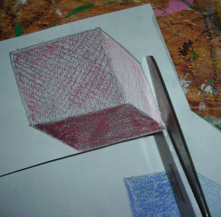
My first project for 4th graders is going to be a shading lesson on cubes. I haven't decided yet whether to use pencils or oil pastels, but I am trying out both. Today I'm using the Dixon Laddie pencil (middle size above -- it is just a bit skinnier than the Beginner).
First, this is what they sent me:
OH, BOY!!!!! Don't you just want to dive right in?!!!
They not only sent their own products, but comparison products to test them against.
Well, I am starting with my favorite all time pencils, Dixon Ticonderoga. They sent the regular size, which are great, but I actually favor their "Laddie" and "Beginner" styles for the thickness. I LOVE this product!! The beginner pencil below is probably 3 or 4 years old. These pencils are a lot like using regular art drawing pencils. Yes, the eraser is gone by now, but the pencil is still going strong. We use Magic Rub erasers anyway, the the eraser on the pencil is not a big issue for me.
My first project for 4th graders is going to be a shading lesson on cubes. I haven't decided yet whether to use pencils or oil pastels, but I am trying out both. Today I'm using the Dixon Laddie pencil (middle size above -- it is just a bit skinnier than the Beginner).
I am planning a directed lesson on how to draw a cube, starting with a square for the front side, then 3 parallel lines drawn diagonally towards the "B" side (that is why I'll have the kids write "A" and "B" on their papers -- so they don't get confused about directions. Then they'll connect the diagonal lines drawing lines parallel to the original top and right side lines of the square. I'll circulate and check angles and parallels as the kids work. There are always a few who have spatial issues.
Next the shading begins. I have students draw an arrow indicating the source of the light. Actually, I usually do a quick demonstration with a box and a flashlight, proving that light doesn't bend around corners.
After shading the 3 sides with the regular lead pencil, (VERY light on top, medium value in front and darkest on the right side) kids will go over the regular lead with the color of their choice of Prang Triangular colored pencils. I had never used these before and after one session, I am sold and I am ordering some next week!!! The color is soft and easy to get even coverage, they are thick like the Dixon Laddies and they are really easy to grip with the triangular shape. I didn't find any down-side to this product.
The next step is to make 2 more cubes, one medium size and one smaller, all shaded with a different color and using the same light source. When that is done it's time to cut them out. I usually review with students how to old and use scissors (I'm always surprised at the variety of ways kids can do this!!) See tips here. Notice that this right handed cutter is cutting on the right side of the cutting line -- much easier to see this way. A left handed cutter would start on the left side of the cube with the scissors on the left side of the cutting line.
You can see where I am heading with this lesson in the photo below. Students will create a "still life" type background for the cubes to be glued upon. I like the idea of having one of the smaller cubes look like it is falling or flying through the air!!
Notice that little red pencil sharpener?? It came with the Prang colored pencils AND they thoughtfully made it with 2 sized holes, one for regular pencils and one larger for their larger sized pencil -- love it. Now, at school, I have an electric pencil sharpener (I think it's a Boston X-acto School Pro) and it is another of my favorite things -- as a matter of fact I need to order another one, as mine is showing signs of giving up soon (it has GOT to be 10 or 12 years old -- time for a new one)!! Anyway, I take care of the pencil sharpening in the classroom, but this little red one is going to be great for at home because I don't have a larger sized one here.
I think I will follow up with part 2 of this lesson (the background and frame) later -- this post is getting to be WAY too long.
And, as promised, here is the link Dixon Ticonderoga gave me for our exclusive coupon for a set of their Prang Watercolors. I'll be doing a comparison test with them and the Crayola brand they sent me soon.
Coupon Link click HERE.
To all of you who starting classes this week, hope you get off to a GREAT start!!
Wednesday, August 14, 2013
Summer is Coming to an End
Hard to believe that in one week our students will be "back in the saddle" at school!!
We have a parent meeting the first day of school in our Auditorium and this is what will greet attendees:
I asked pairs of 2nd graders to paint the cut-out figures last Spring using lines and patterns. Then I collected some artwork from a few classroom teachers and from my program and tucked it away for now. The other day a friend and I spent a few hours cleaning up the bulletin boards (removing old staples and little bits of paper stuck under them -- one of my pet peeves!) and putting up the new artwork to start the 2013-14 school year with a fresh look. I LOVE this time of the school year when everything is starting anew: great expectations and clean rooms!!!!
We have a parent meeting the first day of school in our Auditorium and this is what will greet attendees:
I asked pairs of 2nd graders to paint the cut-out figures last Spring using lines and patterns. Then I collected some artwork from a few classroom teachers and from my program and tucked it away for now. The other day a friend and I spent a few hours cleaning up the bulletin boards (removing old staples and little bits of paper stuck under them -- one of my pet peeves!) and putting up the new artwork to start the 2013-14 school year with a fresh look. I LOVE this time of the school year when everything is starting anew: great expectations and clean rooms!!!!
Tuesday, July 23, 2013
Visual Texture and Analogous Colors
One of the things I like about summer is having TIME to mull things over. For quite a few weeks, I've been contemplating using one basic color and its analogous colors to create an overlapping collage. So, today I got out the crayons, watercolors, scissors, foam core and glue and started putting the ideas into practice.
While that was drying I made some squares with crayon line designs that would create visual texture once the watercolor wash went on top of them. In the classroom I plan and asking student to choose a shape for their "tiles". I chose squares, but I think circles, ovals, petal-shapes etc would be great, too.
Then came the watercolor crayon resist wash -- in different shades of green.
When the squares dried (which didn't take long) I cut them apart. Actually, in the classroom this would be the start of Day 2.
I actually spent quite a bit of time arranging and rearranging my tiles on the background, turning the tiles to see how the textures looked in different places and with their predominant lines facing different directions.
Small pieces of foam core were for raising some of the overlapped tiles.
The last step was to glue everything down and decide what color matte would look best with the greens.
First step was to mix some greens in the watercolor lid (this is why I ONLY use watercolor pans with white lids in the classroom -- so you see the true colors you mix.
Next was a wet-on-wet wash of mixed greens.
Then came the watercolor crayon resist wash -- in different shades of green.
When the squares dried (which didn't take long) I cut them apart. Actually, in the classroom this would be the start of Day 2.
I actually spent quite a bit of time arranging and rearranging my tiles on the background, turning the tiles to see how the textures looked in different places and with their predominant lines facing different directions.
Small pieces of foam core were for raising some of the overlapped tiles.
The last step was to glue everything down and decide what color matte would look best with the greens.
I am thinking about this for 4th or 5th grade with part of the lesson focusing on Unity/Harmony. I took some photos last year on my trip to Montana with the intent of students using them as inspiration for visual texture and I may use these to kick-start some ideas for the textures kids could use. Here are a few:
I like the idea of having students use neutral color photos and then interpret them using colors from the color wheel. I have a few other ideas for using pictures like these this year -- am still working them (at least in my head)!!! Bye for now. . . .
Saturday, July 13, 2013
Teacher's Perfect Summer Morning
Yep, this is my idea of a perfect, lazy summer morning. All I have to do is decide whether to make some more apricot jam with these scrumptious Blenheim apricots from the Farmers' Market, try my new recipe for Israeli Couscous with these cherry tomatoes (that are just as sweet as the apricots) or read a book. One of the best things about summer is having that feeling of having all the time in the world and not living according to a bell schedule!!
I did start sketching ideas and scanning my Pinterest boards for ideas for next year's art lessons last week, but only spent a little time on it. Will share when I get further along.
Have a happy summer week-end!!!
Thursday, July 4, 2013
Happy 4th of July
I just finished assembling these yummy kabobs (idea came from Pinterest, of course). Blueberries, strawberries, brownies and a marshmallow for a little red, white and blue dessert for tonight. SUPER easy!!!
Hope you are enjoying the day!!
Subscribe to:
Posts (Atom)